Common Interior Design & Facilities Errors
Walking inside a restaurant is like walking into the belly of an advertisement. Everything communicates. Unlike typical ads, which often just engage one, two or three senses maximum, a restaurant touches all five of the human senses. This raises the stakes substantially on customer expectations and performance levels necessary to compete effectively today.

1. CLUTTERED HOST OR GREETING STATIONS
Guests should be greeted by a smile, not a messy, overcrowded host station. This area at a restaurant is not a locker for hosts or hostesses, but rather a space that allows the team to efficiently do their jobs. The station should be clean, orderly, and only visibly contain those things that are absolutely necessary. Mint tins, drinks, hair ties, and knick-knacks should all be kept in the employee area in the back. People are more welcoming than items, so make sure the host is greeting customers, not clutter.

2. POOR FLOOR PLANS
Inefficient floor plans, wait stations, bar setups, and table configurations impede servers and customers. Consulting with an architect who has restaurant experience prior to building out the space is ideal. Even the perfect space for a restaurant can fall short if the layout of tables and chairs is wrong. The most common problem: many configurations simply don’t provide enough seating capacity. Other arrangements place certain tables in areas where high amounts of traffic naturally converge. Both situations should be avoided. To ensure that each table is well-situated, managers should sit at each during service to observe which have too much noise, traffic or fall short in other ways. If the configuration is not optimized, guests and servers alike will suffer from the inefficiency.
3. IRRELEVANT DECORATIONS
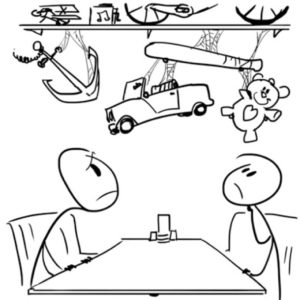
Clunky, dirty, dusty, or other decorations that don’t help tell the brand story actually detract from profits. The entire restaurant needs to be centered on the brand story and personality. As with anything, good planning helps with execution, so start by writing down the vision for the restaurant. From there, think about the restaurant design, decorations, lighting fixtures, and even the chairs and tables. Remember, everything placed inside a restaurant must support its story. Every item should contribute to communicating the brand promise, positioning and personality. Teddy bears on the shelves in the dining room of a luxury, white-tablecloth restaurant sends a mixed message. Get rid of irrelevant decorations and make sure to dust decorations regularly, as any sort of dust or grime detracts from the overall atmosphere.
4. EXPOSED SERVICE AREAS
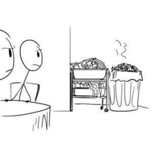
Visible bus pans or overflowing trashcans detract from a guest’s restaurant experience. A restaurant’s primary function is providing good food for its visitors. Many people wouldn’t cook in a dirty kitchen at home, and they certainly don’t want to pay for food prepared in a restaurant’s dirty kitchen. If guests see overflowing trashcans, bus pans, clutter, dirty dishes piled in a sink or other unsightly areas, they are likely to feel less comfortable, and view the meal as less valulable. While managers and servers may become desensitized to these areas, guests are not. Make sure behind-the-scenes operations stay backstage and don’t encroach upon diners.
5. BATHROOM DOORS
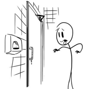
Doors to bathrooms that push in rather than out bother customers. When designing a restaurant, pay attention to the details. Most bathrooms are placed in an area where the door can open out just as easily as it can open in. Guests prefer the former option because they don’t have to touch the bathroom door handle when exiting. If a bathroom is in a place that necessitates the door opening in, however, place a trashcan right next to the door on the inside so visitors who didn’t want to touch the handle can discard the paper towels they used to open the door.
6. NOISE POLLUTION
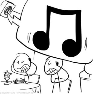
Acoustical issues, such as music or ambient noise that is too loud or too low, distract. Just like it’s important to finding the perfect number of servers, there is a fine line between too much noise and an uncomfortably silent dining room. Guests don’t like to feel as if they are in a library, but they also don’t necessarily want to experience a rock concert while eating dinner. There should be a comfortable amount of noise to facilitate normal conversation where no one feels the need to whisper or shout. Silence often seems sleepy, which applies to the restroom as well. Create ambient noise by playing music in the restaurant and in the bathroom. Also, make sure to use furniture like couches and drapes to dampen sound and reduce echoes.

7. DIRTY LAUNDRY
Spending too much money on linens or cleaning services is inefficient, and linen-cleaning services are expensive and often unnecessary. Many restaurants make the mistake of thinking only white tablecloths are up-scale, but nice wooden tables can create a similar effect. Restaurants that employ linens to cover up bad tables end up spending more in the long run than if they had bought new tables. On the other hand, restaurants that use linens on good tables are wasting money. If linens are being used, try to find some that can be cleaned in-house, rather than through a service – it’s an easy way to save money.
8. INTERIOR DIRECTIONAL SIGNAGE
Restaurants that neglect interior directional signage and zone merchandising miss out on profits. Zone merchandising consists of identifying the various zones, or marketing channels, used to communicate with guests throughout a restaurant, and using each area to plan in-house marketing. Some key sections, or zones, are TVs, tabletops, windows, bathrooms, greeter stations and more. Restaurants that use this marketing technique create an engaging, fresh atmosphere – a tone that is consistent with the business story and perspective. Interior directional signage also helps visitors make sense of a restaurant by enabling them to find the exits, restrooms and other important areas. Both types of information are important, as they help guests feel more comfortable and welcome.

9. SPACE PLANNING
Space is money, and an inefficient use of space, including storage, prep, service and POS stations, decreases a restaurant’s efficiency. Inefficient storage of food or a poorly planned organization in the kitchen slows down staff, thereby increasing the time it takes each guest to finish dinner and decreasing the number of customers that can be served in a given night. To illustrate the cost associated with every inch of a restaurant, think about the money and space that could be saved by consolidating several pieces of equipment and purchasing one appliance that serves multiple functions. When measuring performance, make sure to consider sales by square foot averages and think about how costs can be decreased by better utilizing the space.
10. INADEQUATE BOH SYSTEMS & CONTROLS
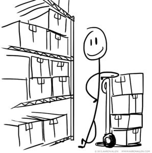
There is a lot of work that goes into food preparation before ingredients even hit the counter. Restaurants that don’t have clear, efficient systems and controls in place tend to throw out a lot of food or, worse, serve bad dishes. Systems that ensure all deliveries are correct, including the quality and quantity of items received, and that food isn’t wasted because of improper storage should be in place. This should also check that employees aren’t skimming supplies. Establish checklists and clear chains of accountability. It is easier for these things to get missed if no one can be held accountable (people who place orders shouldn’t e in charge of receiving them), so ensure that there is one employee in charge who can’t pass the buck. If multiple employees oversee storage of ingredients, make sure there is a clearly defined chain of responsibility.
Common Exterior Design & Facilities Maintenance Issues
A guest’s experience at a restaurant starts long before the greeting from the host or hostess. Everything from the placement of signs, the paint on the outside of the building and the parking lot communicates and sets the initial tone for a restaurant brand. Here are some of the most common mistakes restaurants make with the exterior of their establishments.
1. LACK OF SUFFICIENT SIGNAGE
Signage and business signs are more important than many people realize. Improper signage can cost a business as much as $1 million each year in potential revenues, so be the building owner allows the display of elements like blade and pole signs before committing to a lease. Restaurateurs should also ensure that city ordinances allow signs to be displayed, before ordering and installing those materials. One given the go-ahead, walking and driving by the restaurant, like guest would, to see what kind of marquees will work best for Once you have the go-ahead, drive and walk by your restaurant like guests would to see what kind of marquees will work best for your location. Blade signs that stick out into the road are a good idea for many establishments.
2. UNCLEAR CONCEPT
Restaurants often don’t make their concept clear from the exterior design and signage. When establishing a business, there should be a clear idea of the brand message, tone, and promise. It’s best to lay this foundation well at the beginning of the process (though it can be corrected later on, it’s worth the investment to get it done right up front). Having a concept is important, but making that concept clear at a restaurant is even more so. Figure out the brand personality (if the brand was a person, how would it walk, act, talk, dress, and behave?), promise, position, and story, and make each apparent to guests visiting the restaurant. The best solution, though, is to consider these four questions when designing your building’s exterior.
3. RIGHT OF WAY ISSUES
Location, location, location. Right-of-way issues that make it difficult to get to the restaurant during heavy traffic periods decrease business. It doesn’t matter how good a restaurant is if people can’t reach it, so make sure to pay close attention to the location of a potential restaurant prior to signing a lease. This means both considering what area the building is in and researching the traffic patterns surrounding it, and investigating street-side visibility. Guests should be able to see and reach a restaurant with ease.
4. INSUFFICIENT PARKING
It’s easy to overlook parking, but guests often get frustrated to the point of dining elsewhere if parking is impossible to find. If a lot has insufficient parking but there is room to add more, do so – and do it quickly. Mandatory valet parking to solve a lack-of-space is a poor solution, as many visitors would prefer to park slightly further away than to have to pay for a parking service. On the flip side, it is a good idea to offer an optional valet, if it is appropriate for the tone of a restaurant. The increased business from offering both options will more than makeup for the expense of the valet.
5. EMPTY PARKING LOTS
While insufficient parking and packed lots are their own issue, having an empty parking lot can be just as much of a curse. People view empty parking spaces as a sign of an unpopular or bad restaurant and tend to stay away. Seeing cars in front of a restaurant is similar to reading good reviews online: people assume that busier establishments are better ones. One strategy that worked well for my father was having the staff park in front of the restaurant early in the day (when there were fewer customers), then move their cars further away into the back lot when business picked up. This way, there were always cars in the lot.
6. NO MENUS OUTSIDE
Restaurants without exterior menu boards, or old, tired, faded boards outside, look unsafe and uninteresting. A restaurant exterior, including any menu boards, reflects the concept and brand. If the outdoor menus are faded and falling apart, the restaurant will look similarly outdated and tired. As this can be one of the first impressions for many new customers passing a restaurant, it can have a negative impact on business. An exterior menu is like a free advertisement, so make sure to spend the time to make it attractive and keep it maintained. A board that is up to date and clean can bring as many as 20 new guests in each night.
7. TIRED EXTERIORS
Run-down, tired-looking exteriors reflect poorly on an establishment. In many cases, it doesn’t matter how good the food is – if a restaurant looks unsafe or uncared for, most potential guests will pass by on their way to another option. While parking lots are expensive to re-pave, adding a blacktop is a simple way to give a lot a clean, updated aesthetic. Commercial landscaping can also make your exterior livelier and more appealing to customers. Make sure outdoor lighting is brighter than indoor lighting in the evening so the restaurant is a beacon to hungry passers-by. Paint the building, clean windows every day, replace dead or flickering light bulbs as soon as they go out and make sure to care for plants and grass around the property regularly. Most restaurants don’t budget for this care, and thus can’t afford these measures when they are necessary. To avoid this, budget between 1% – 2% of total sales for on-going maintenance projects and up-keep.
8. FILTHY PARKING LOTS
Having trash and debris within restaurant property line looks untidy. Litter is incredibly unattractive, and while most guests understand that restaurant staff aren’t the ones who left trash in the lot, it still reflects poorly on the restaurant. Cleaning up the parking lot and exteriors several times a day is just as important as keeping the floors and counters inside a business clean. This is a simple task, but it can drastically increase the amount of new visitors. Placing garbage bins outside of each entry door allows visitors to throw away gum, coffee cups, and other trash they may have with them when entering or leaving.
9. VISIBLE SERVICE AREAS
Unsightly service areas, like garbage and dirty equipment, that are visible to customers can ruin a meal. The outside of an establishment should be as clean as the interior. This means emptying and cleaning trashcans and dumpsters regularly, not leaving rubber mats out to dry on the patio while guests are still there, and cleaning dirty equipment. If anything smells bad, clean it. The dirty-dumpster smell from unwashed trashcans can be horribly unpleasant. The only place a customer should encounter something as unsightly as a trashcan at your establishment is outside of the front door.
10. LIGHTS OUT
Restaurants that leave their lights out, neglect landscaping or allow their entrance to be cluttered send the wrong message. One of the worst mistakes restaurateurs can make is accidentally creating the appearance that their restaurant is closed, either permanently or for a short period of time, when it is not. Restaurants should be convenient, welcoming and easy to access to attract as many guests as possible. Landscaping that looks like no one has ever tended to it burnt out lights are universal signs that an establishment is either closed for repairs or has been shut down.
RELATED CONTENT
20 Most Common Restaurant Service Mistakes
10 Trends Reshaping the Restaurant Industry
Questions to Answer Before Launching a New Menu
Are We Relevant?: Questions to Ask During a Restaurant Brand Audit
ABOUT AARON ALLEN & ASSOCIATES:
Aaron Allen & Associates is a leading global restaurant industry consultancy specializing in growth strategy, marketing, branding, and commercial due diligence for emerging restaurant chains and prestigious private equity firms. We have helped restaurant companies around the world drive revenues, increase profits, and enhance the guest experience through improved marketing, messaging, and menu engineering. Collectively, our clients post more than $100 billion, span all 6 inhabited continents and 100+ countries, with locations totaling tens of thousands.
