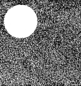
When the area is cluttered, and one spot has nothing there, the eye will go to the empty spot. This is the concept of negative space. Use it in your menu design to highlight items. Read on to find out how.

Menu Design: Successfully Using Negative Space
Amateur marketers have a natural inclination to say “everything” they can in an advertisement. This is largely influenced by the old days of pay-by-the-column inch. Since they bought “space” they wanted to fill it. Notice though, when one area of a newspaper is copy-heavy with lots of text all over and then there is a negative space which is free of copy (think of an Apple advertisement), then the eye is drawn there. The eye goes to the negative space.
Likewise – on a menu – when you have a lot of items and copy and are trying to cram a lot on to one page, the human eye will look for a starting point. When you put a pocket of negative space, you pull the eye there. So, in limited use – coupled with other menu merchandizing techniques – putting negative space around an item can call attention to it and help you sell it.
Restaurant Consultant
Aaron Allen & Associates provides a holistic approach to the restaurant business. From conception to implementation, we pride ourselves on our commitment to the details, building concepts from the inside out. With experience in all 6 inhabited continents, in over 100 countries, and a client base who posts a combined $100 billion annually, we let our results speak for themselves.
