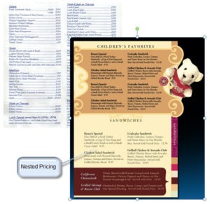
Nested pricing is essential for your restaurant menu design. Read about the psychological implications of nested pricing versus pricing in a column on the right, and how this small difference can help boost your restaurant revenue.

Menu Design: Nested Pricing on Restaurant Menus
Why Column Pricing is a Problem
We have all seen those Chinese restaurant menus with the dot-dot-dot leading from a generic menu item name on the left to the price on the right. All the prices are lined up in a column. Why is this a problem for your restaurant menu design?
The set-up encourages customers to view your restaurant as a generic commodity and read from right to left instead of left to right. Guests will scan for the lowest price instead of the most interesting item.
The Goal of Menu Design
The goal is to get them to scan the unique item names and well-written descriptions and make their choices based on what sounds/looks good. Considering the price should be secondary, not primary.
Nested pricing is where the menu price comes after the description and is “nested” into the description using the same size font. After a period to end the description, there should be two spaces and then a price (without dollar signs.)
Aaron Allen & Associates provides a holistic approach to the restaurant business. From conception to implementation, we pride ourselves on our commitment to the details, building concepts from the inside out. With experience in all 6 inhabited continents, in over 100 countries, and a client base who posts a combined $100 billion annually, we let our results speak for themselves.
